
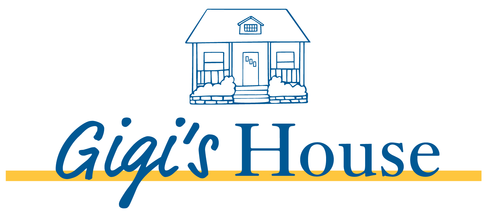
GIGI'S HOUSE
In-Home Child Care Facility
Overview & Target Client
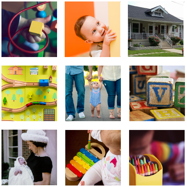
Gigi’s House provides child care services and preschool programing to children ages newborn through pre-K. Owner and operator Jeri Spaziani desires to create a loving, trust-worthy, home-like environment where parents and children feel safe, loved, and have peace of mind.
Although Jeri typically has a waiting list, her client's are usually mid- to upper-middle class families who don’t want their child in a daycare setting. Both parents are working and professionals in their fields.
Design
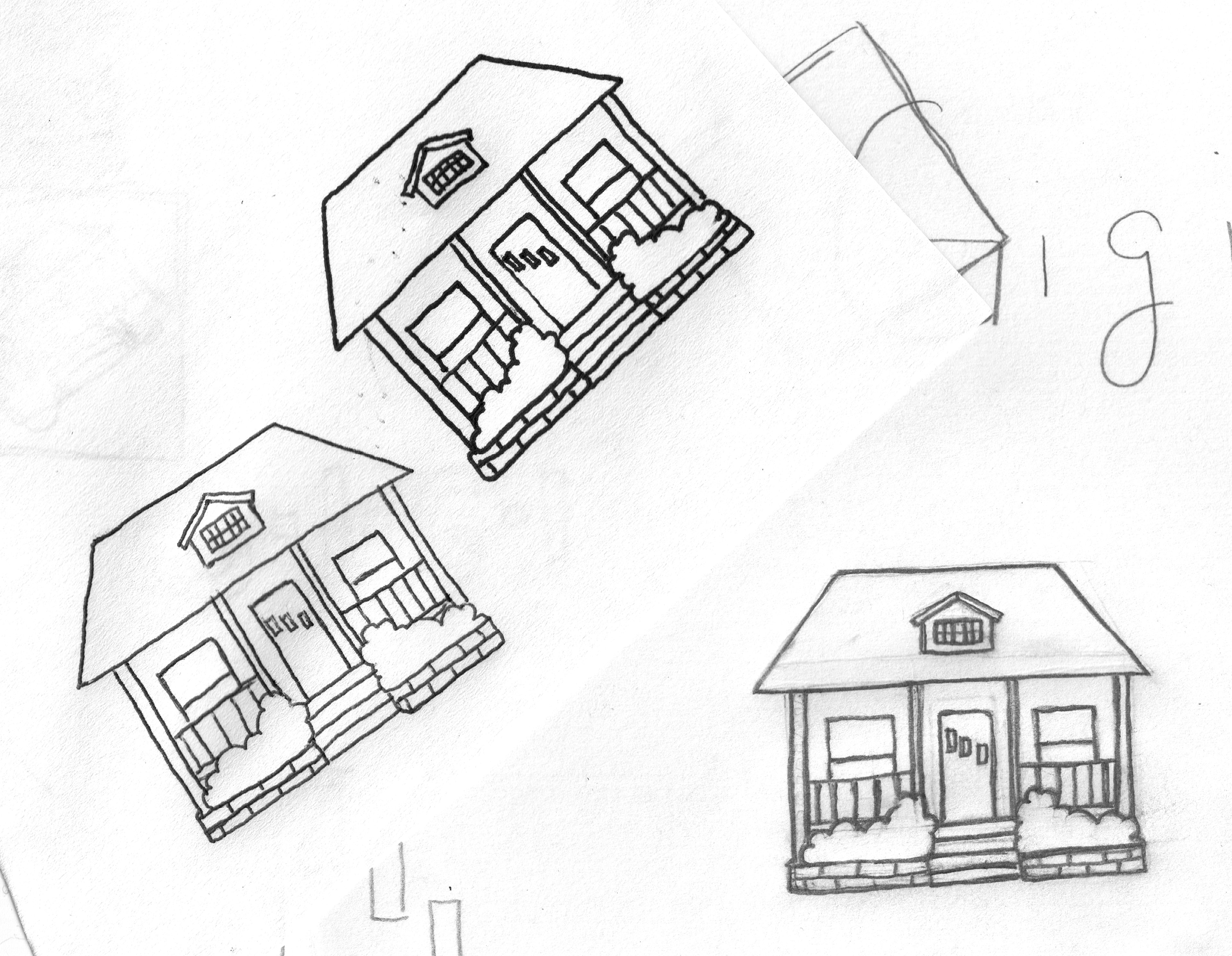
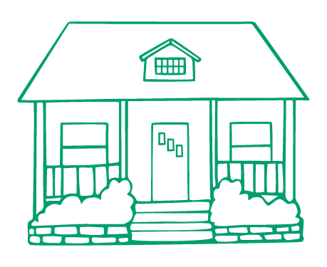
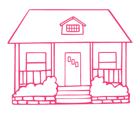
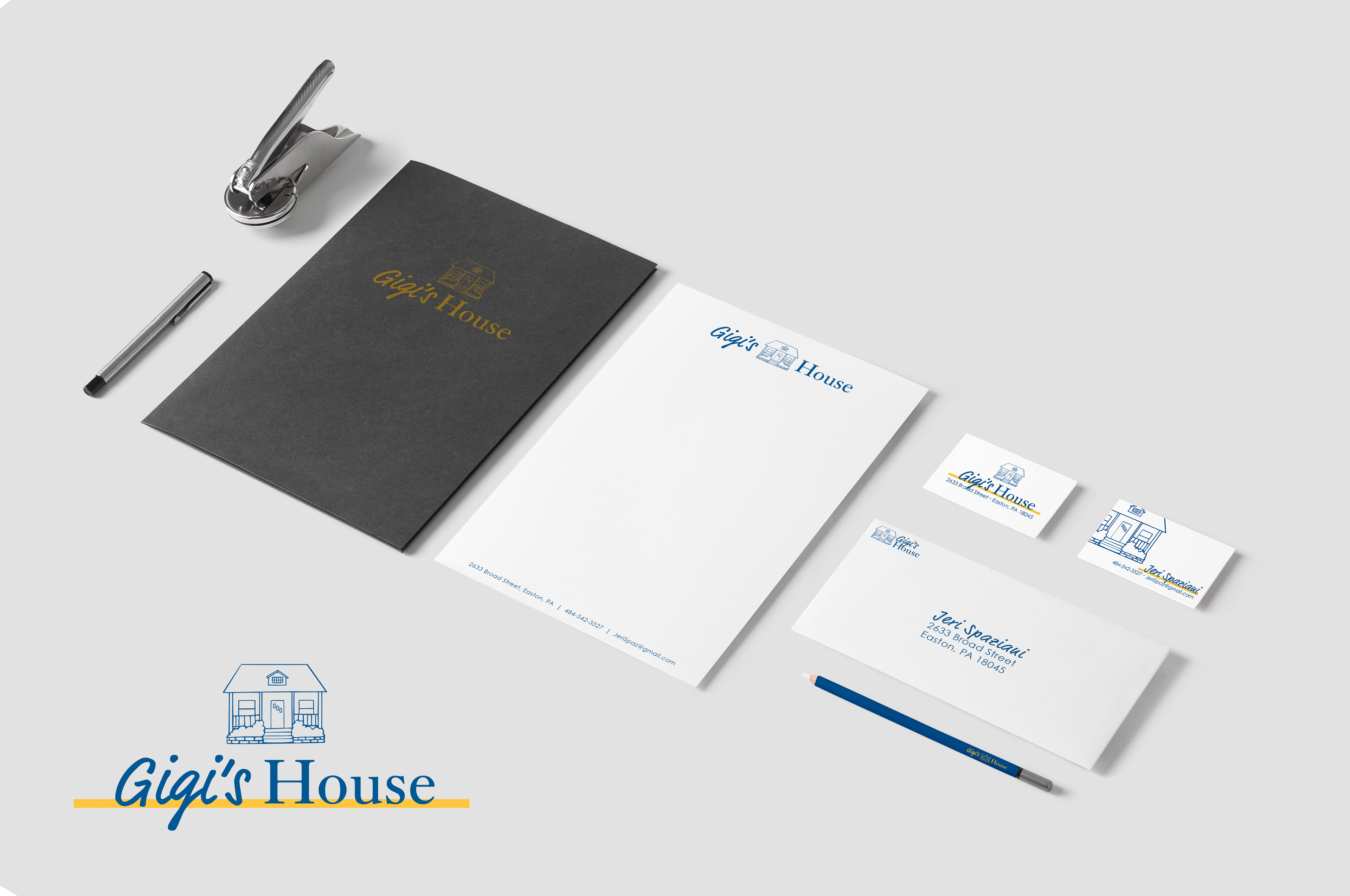
Mark: Jeri has a long complicated story when it comes to the ownership of her home. The late 19th-early 20th century, Cape Cod-style structure was a must-have as an identity element.


Typography: A mix of serif font, providing strength and stability, and script font, reminiscent of child-like fun.

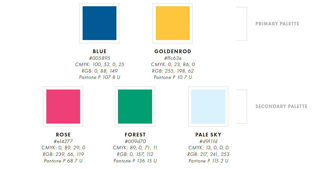
Color: Jeri has always favored blue tones, and the color played well in producing the emotion the identity needed to covey. The result was modern shades of traditional primary colors providing a fresh take on the stereotypical child care facility palette.
These elements combined to provide a branding identity projecting Gigi's House as less of a business and more of a home.

WANT TO MAKE YOUR
BUSINESS IDENTITY AWESOME?
(WITH NO OBLIGATION, OF COURSE)