
LEHIGH VALLEY LEARNING CENTER
Child Care Facility
Overview & Target Client
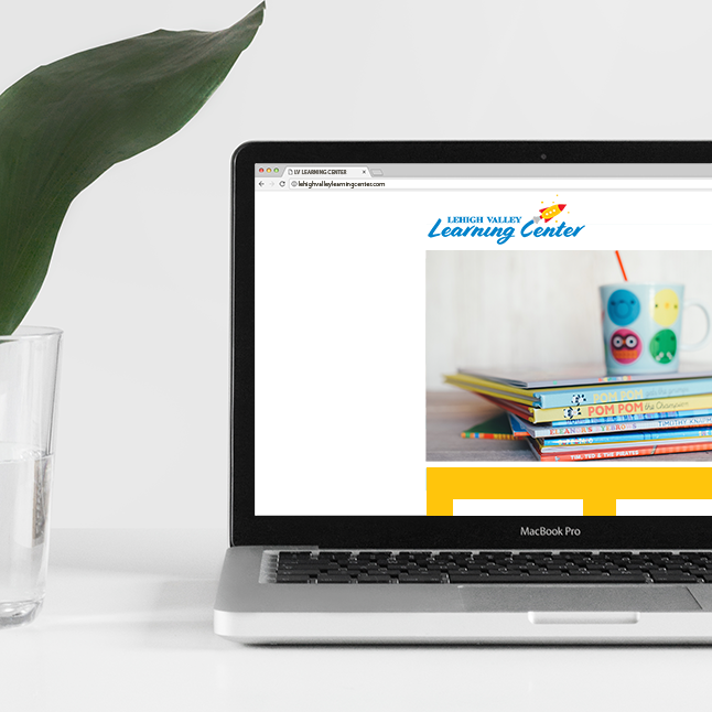
Lehigh Valley Learning Center is more than just “child care.” LVLC prides itself on providing excellent care and education for children, peace of mind for their parents, and a great work environment for LVLC staff. LVLC strives to create a place to allow children to learn, explore, and grow while giving parents peace of mind. Families know LVLC is a fun, educational place to enroll their children. LVLC hopes parents will feel their family’s well-being and child(ren)’s development are the focus.
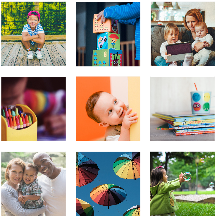
LVLC's target is families with young children, single moms, and working parents who live and/or work nearby the facility in Bethlehem, PA.
Design
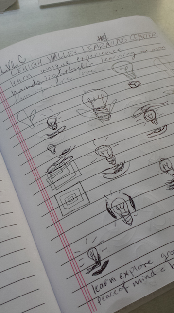
In this logo, the focus was placed on kids and exploration as a means of learning.
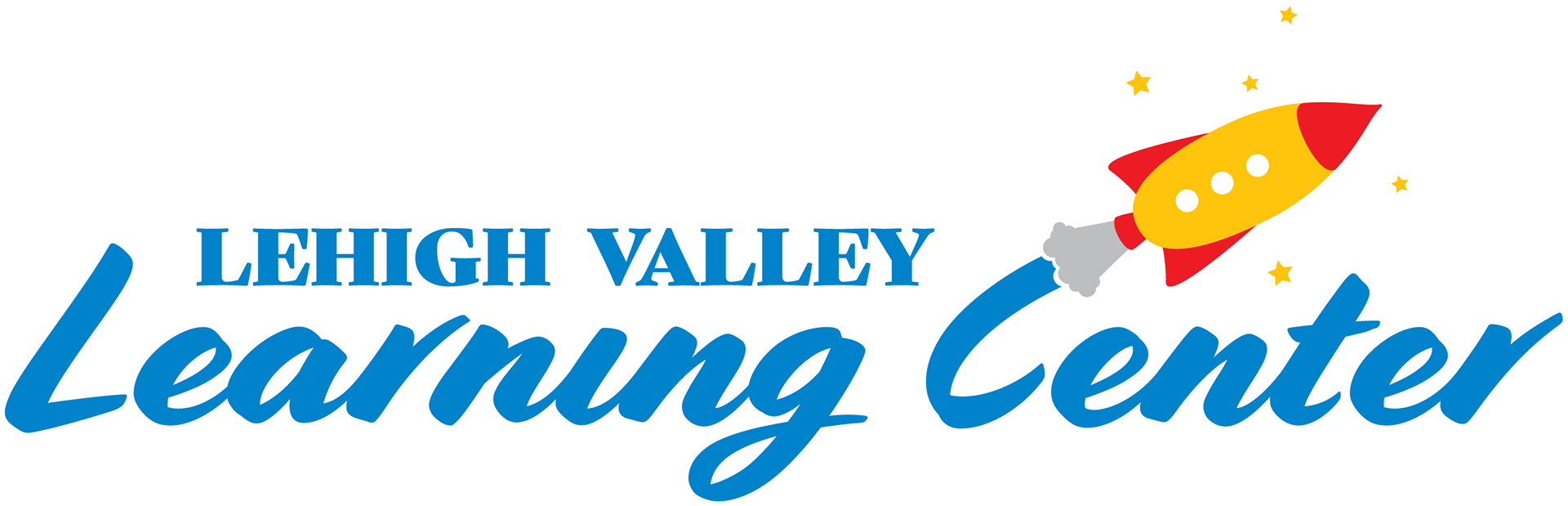
Mark: The mark in this logo depicts a blasting rocket, emphasizing the idea of exploration and shooting for the stars.

Typography: This mix of serif font, providing strength and stability; and script font, reminiscent of child-like fun. The script font also provides a sufficient balance to soften the stronger serif font.

Color: Although the basis of the color palette was those that appeal to children, the primary color depicted is blue, providing a calm, peaceful, and reassuring feel.
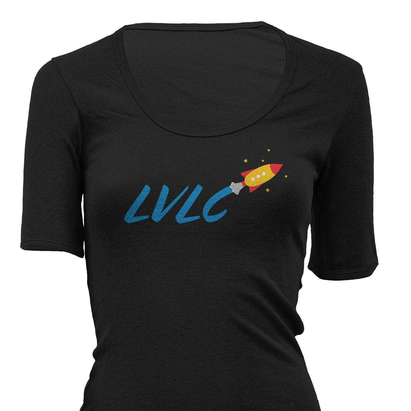
Overall this design is fun, colorful, and approachable, while maintaining a clean-lined, professional appearance.
WANT TO MAKE YOUR
BUSINESS IDENTITY AWESOME?
(WITH NO OBLIGATION, OF COURSE)