NAVARRE EDITORIAL SERVICES
Copyediting & Proofreading Services
Overview & Target Client
Navarre Editorial Services is a small copyediting and proofreading company owned by Jennifer Navarre. NES is built on Jennifer’s experience as a teacher and her innate need to proofread and improve all written communication she encounters.
NES currently targets three types of clients: 1. Authors - children’s books, fiction, or non-fiction. 2. Small Business Owners - copy for marketing materials. 3. College & Graduate Students - proofreading for thesis-length papers.
Design
Jennifer was looking for a clean, easily-read design, portraying a sense of strength, knowledge, and longevity.
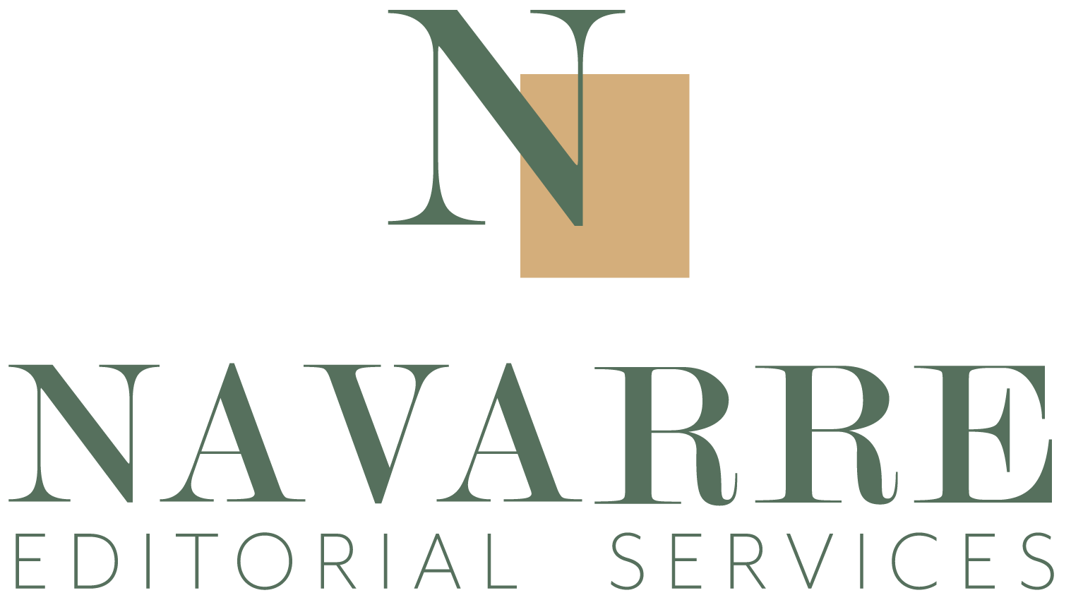
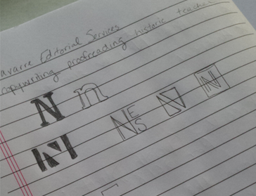
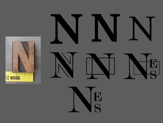
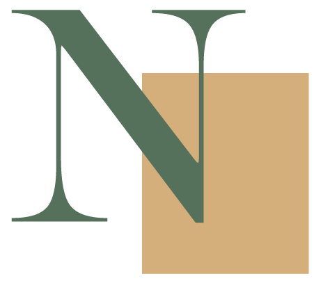
Mark: Jennifer's admiration for history and reading lead to considering American history and the movable type printing press for inspiration. The mark is comprised of the character "N," accented by a rectangular block - a deconstruction of a printing press type block (as seen in the image above "Target Audience"). This rectangular block is also reminiscent of a book cover, targeting the subconscious of a portion of Jennifer's target audience: authors.
Typography: The serif font is not only the style used in early American history and in academic settings, but creates an impression of strength and professionalism. The broader spacing allows for easier readability, while the all-caps display invokes feelings of stability. The sans serif font balances the design, lightening and modernizing the overall look.

Color: This color was directly inspired from an image of the Statue of Liberty in Jennifer's Discovery Phase proof. Calling-back again to the past, the green is that of oxidized copper. The color of the rectangular block was inspired by copper's unchanged color, as well as a set of metal type blocks discovered during research. This combination of colors represents the change that occurs during the editing process. The "copper", the authors' words and meaning, are still very much "copper", yet look a little different after time with NES.
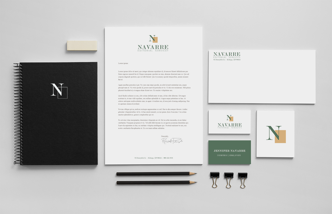
Overall, the resulting design is a strong, stable, professional logo, with more hidden meaning than meets the eye.
WANT TO MAKE YOUR
BUSINESS IDENTITY AWESOME?
(WITH NO OBLIGATION, OF COURSE)