THE DAILY DOSE TRIBE
Daily Live Stream Show & Community


Overview & Target Client
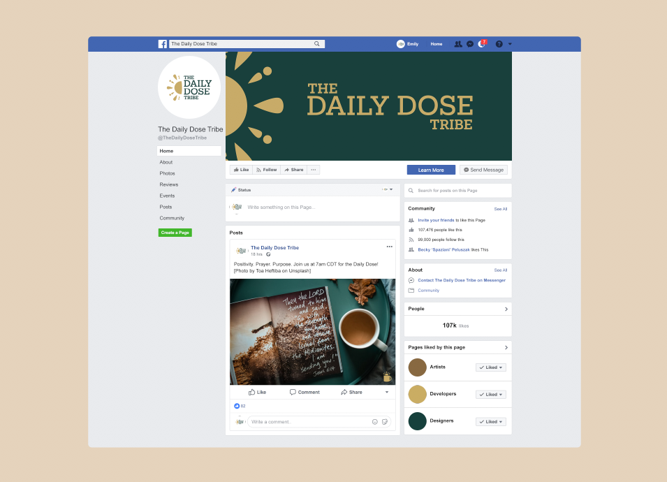
Emily Olson discovered an opportunity to be of service and give back during the COVID-19 pandemic. Already experienced in, and having a love of, streaming live on social media, she decided to take time each weekday morning for positivity, purpose, and prayer and invited others to join via Facebook. The Daily Dose was born.
The Daily Dose provides a way to begin the viewer’s day with a guided moment of positivity, purpose, and prayer with like-minded community, grounding their day in what matters most. Eventually, Emily hopes to tie-in a “pay-it-forward” piece: crowd-funding charitable gifts via Patreon for individual, families, and/or organizations in need.
Although it’s open to all, The Daily Dose Tribe is currently attracting women in their 30s-40s with a Christianity-based faith, many of whom have families.
Design
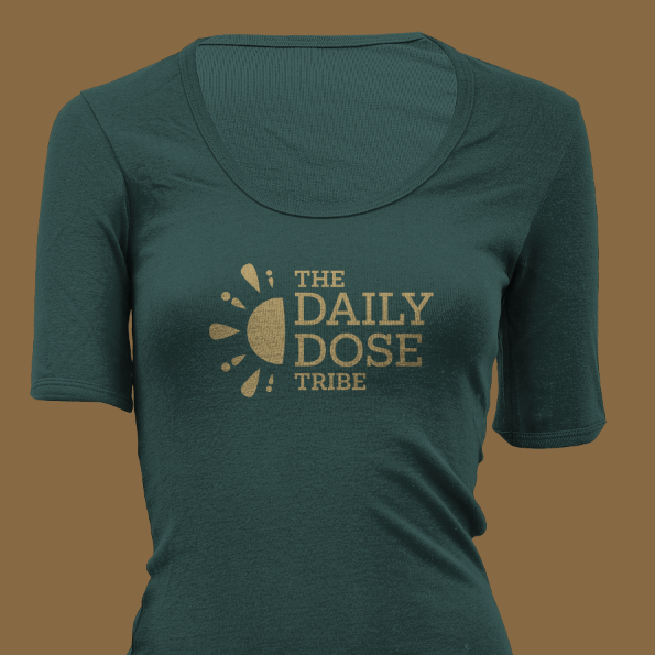
Emily was looking for a logo to attract The Daily Dose Tribe's target audience into a welcoming community of daily positivity, purpose, and prayer.
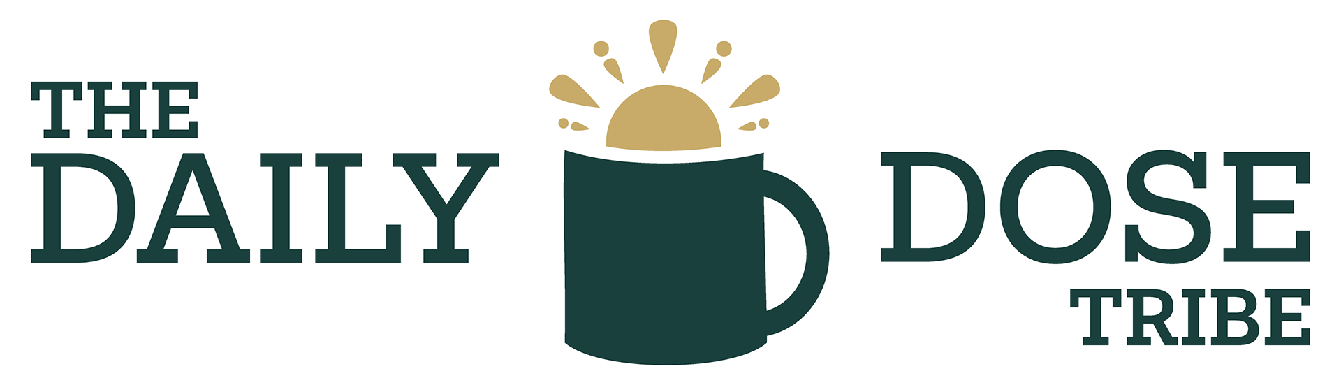
Mark: A coffee mug with the sun rising from it. The mug: A seemingly obvious choice for an icon, a coffee mug is synonymous with mornings, waking up, and starting the day. The sun: Projecting seven rays, the three larger rays reference the three-fold mission of Daily Dose - positivity, purpose, and prayer; the four smaller rays present as abstract figures, bringing to mind the community aspect of the brand.
The combination of these elements subconsciously signal the viewer to see The Daily Dose Tribe as part of their daily morning routine, just as the sun rising and a warm beverage most likely already are.


Typography: Typically a script font would be initial instinct for the audience targeted. However, hearing Emily's strong preference for serif fonts, an appropriate and still very effective choice was made. This selection encourages the feeling of stability and dependability, yet the thinner weight of the characters avoids projecting heaviness or being weighed down.
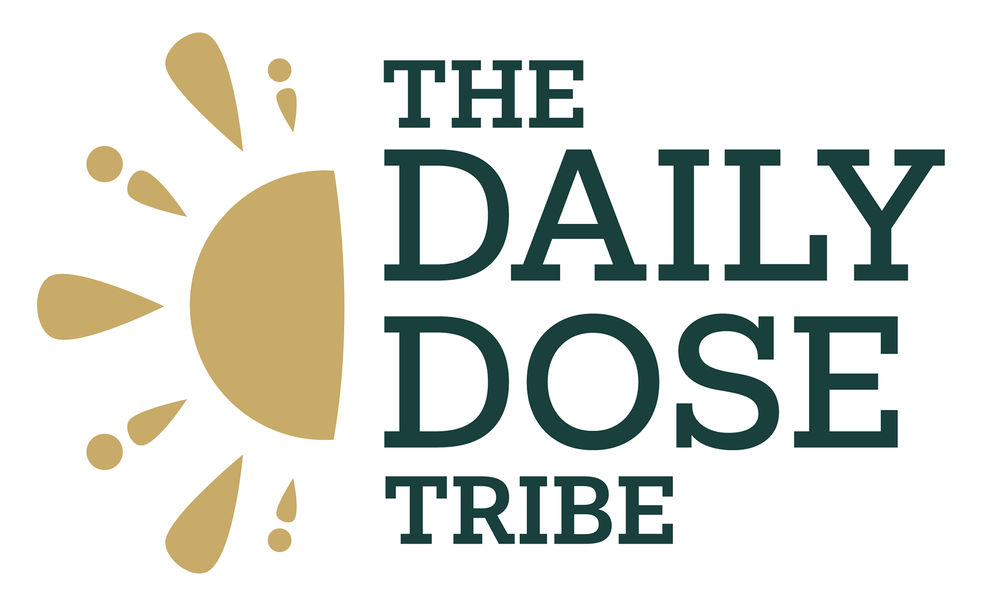
Color: During the discovery phase, Emily seemed to gravitate towards earth tones which worked well to support with the mission of this design. The deep teal, golden tan, and brown serve as the brands primary colors, while the dark cream provides an appropriate supporting color when needed. As previously discussed, the colors meanings, as described by Canva, are below.
Deep Teal: "Teal combines the calming properties of blue with the renewal qualities of green. It is a revitalizing and rejuvenating color that also represents open communication and clarity of thought."
Golden Tan: "Like other browns, tan evokes warmth and security. It also gives a sense of the same earthy stability that many members of the brown family do."
Brown: "The warmth of brown is associated with reliability, healing, and strength. Additionally, many find comfort in the plainness of brown because the color is considered all-natural and earthy."

All of these elements combined create a strong logo, able to attract and support a grounded community of positivity, purpose, and prayer through The Daily Dose Tribe.
WANT TO MAKE YOUR
BUSINESS IDENTITY AWESOME?
(WITH NO OBLIGATION, OF COURSE)